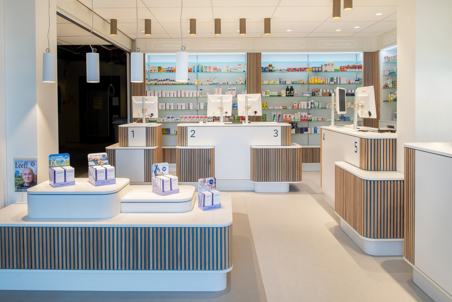
GROUP A is responsible for the new interior identity of Service Apotheek, where the focus is on the positive customer experience, with the theme of Service first. Service Apotheek has ambitious plans for the future. Together with Fabrique, we worked on the ‘brand positioning’. The aim is to make the Service Apotheek brand recognisable both nationwide (corporate) and at local level (pharmacy).
Brand interior concept
Service Apotheek commissioned GROUP A to design a new interior concept that could be implemented in various Service pharmacy. From small to large, from new building to monument, from individual to part of a health centre and from concept store to simple conversion. Fabrique’s brand positioning with the key words ‘Hospitable expert’ is the starting point, and the ‘brand-interior concept’ is further developed in cooperation. Not only the profession of the pharmacist has changed, but also the pharmacy as a ‘shop’ has changed a lot due to the wishes of customers and staff. In addition, the experience aspect has become increasingly important in the choice of a pharmacy. A modern ‘Look & Feel’ is therefore essential, with the following design principles: a feeling of welcome, visual contact, accessibility and openness, privacy, customer comfort and professionalism.
Zoning
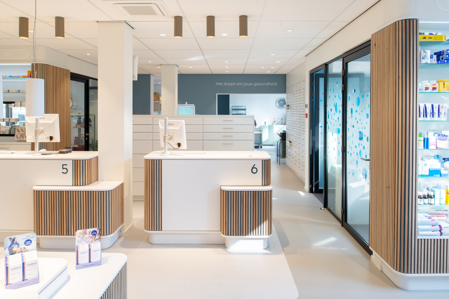
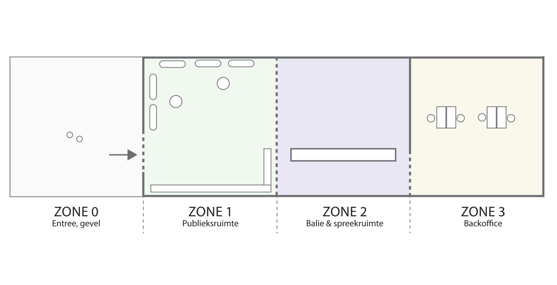
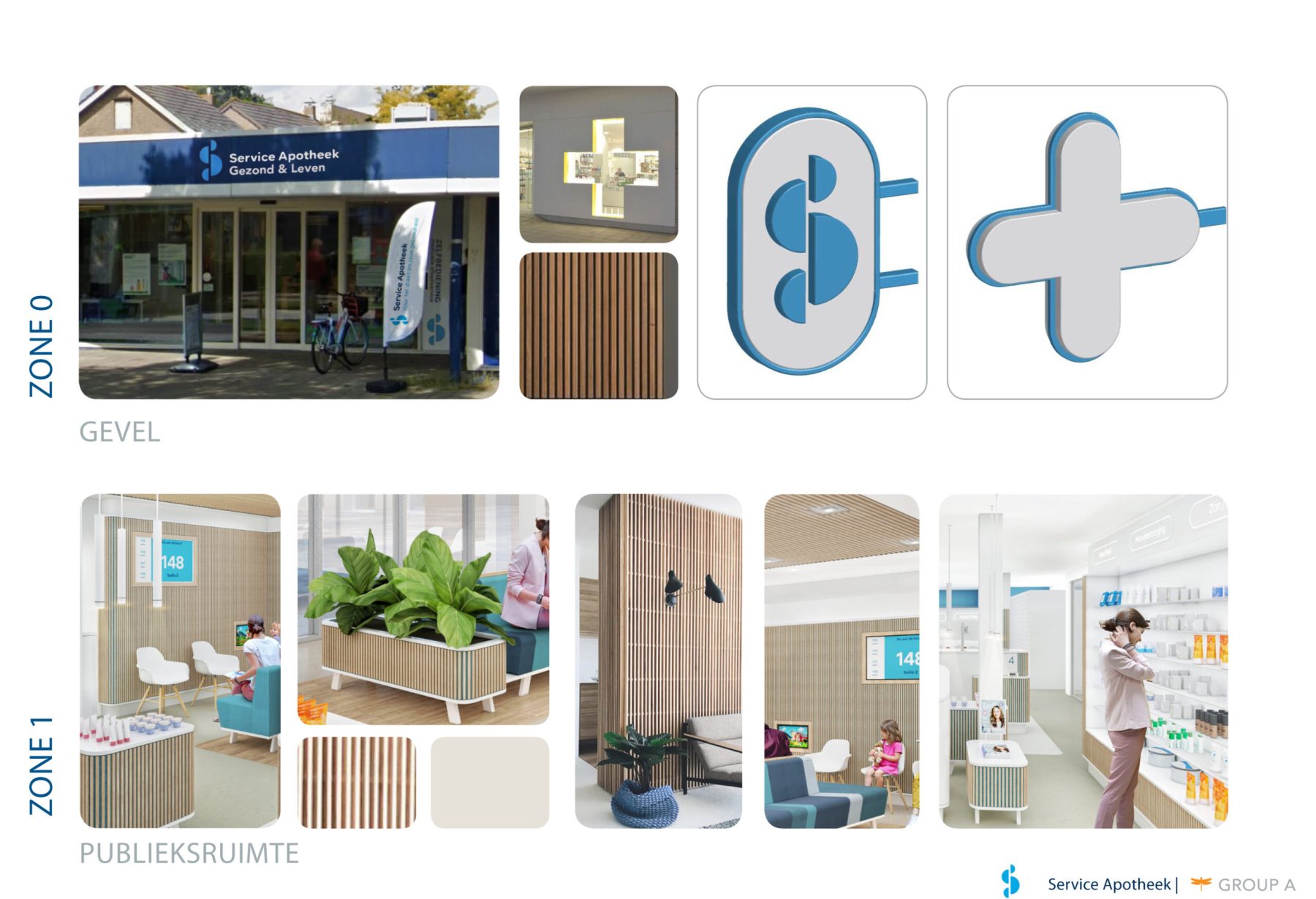
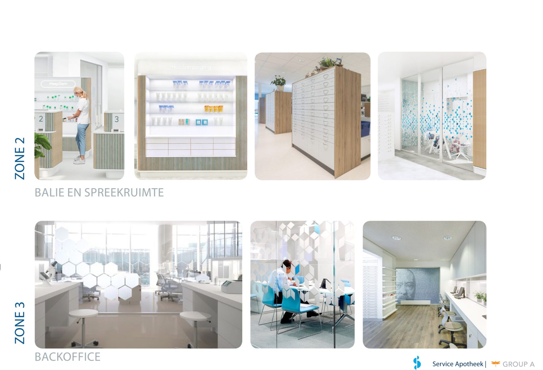
That ‘Look & Feel’ starts at the front door. An open and welcoming reception contributes positively to the image of Service Apotheek. The ‘Zone concept’ was developed with this in mind, in which the pharmacy is divided into four zones and the hard separation between ‘front’ and ‘back’ is removed for a new concept of openness and hospitality. Zone 0 consists of the façade and entrance, zone 1 is the waiting and public area, zone 2 contains the counter & consultation area and zone 3 is the back office. This clear zoning and efficient layout also ensure more privacy and overview.
Toolbox
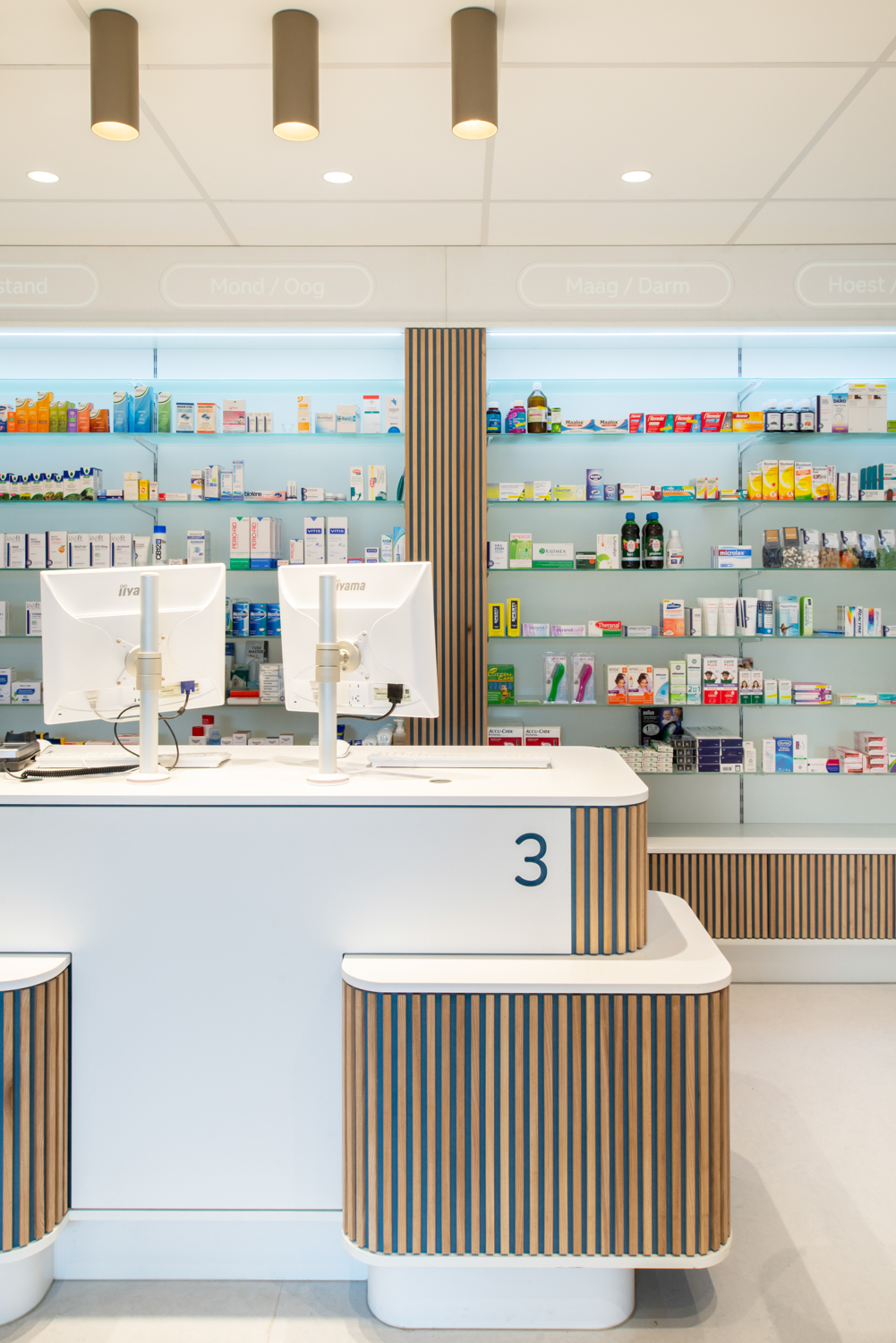
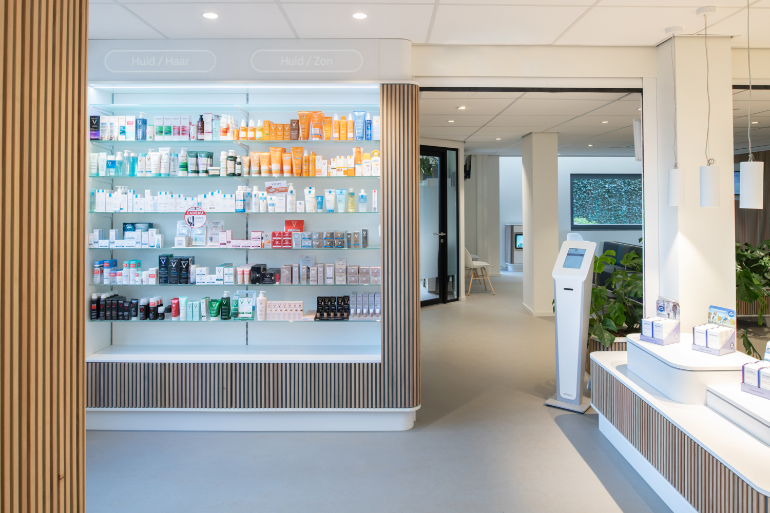
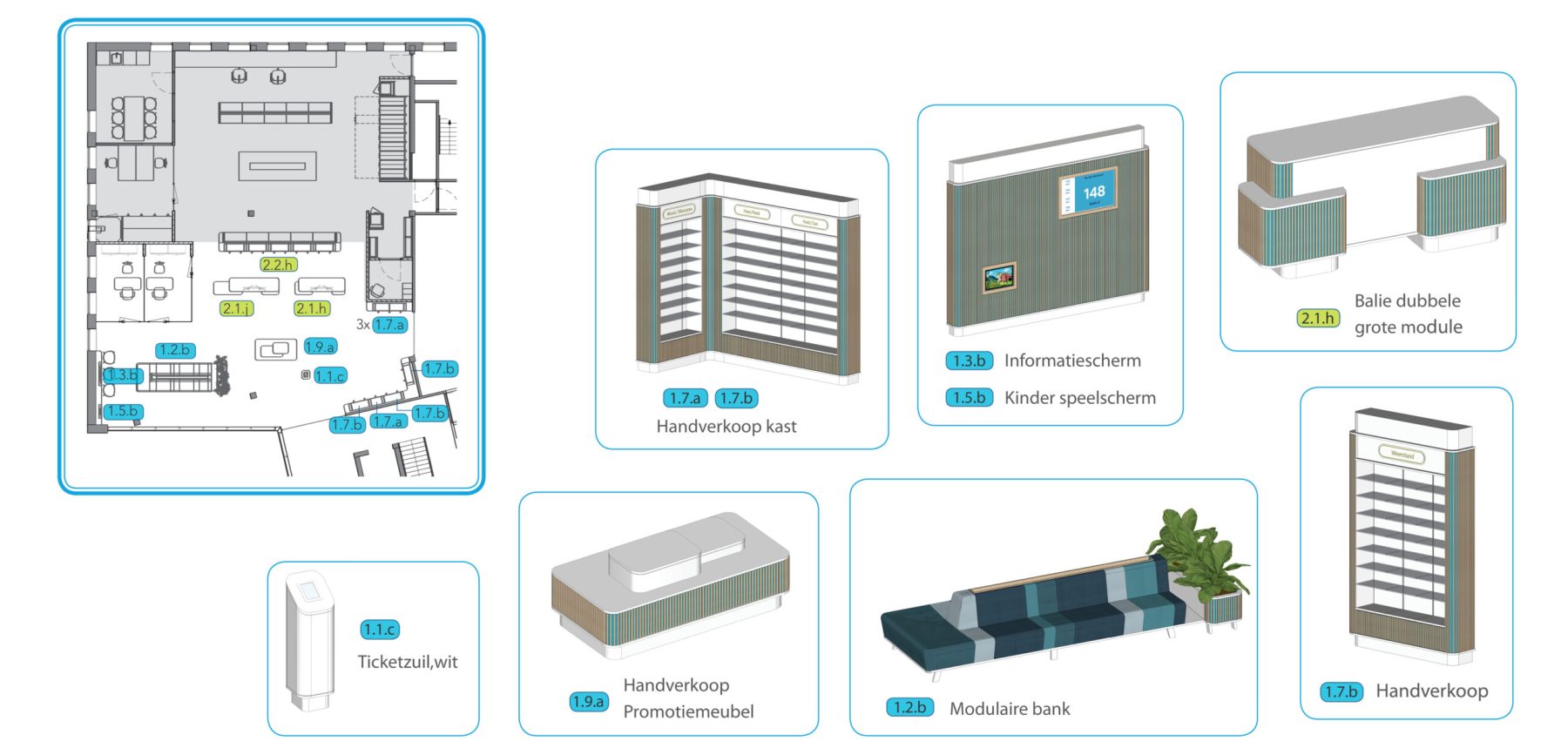
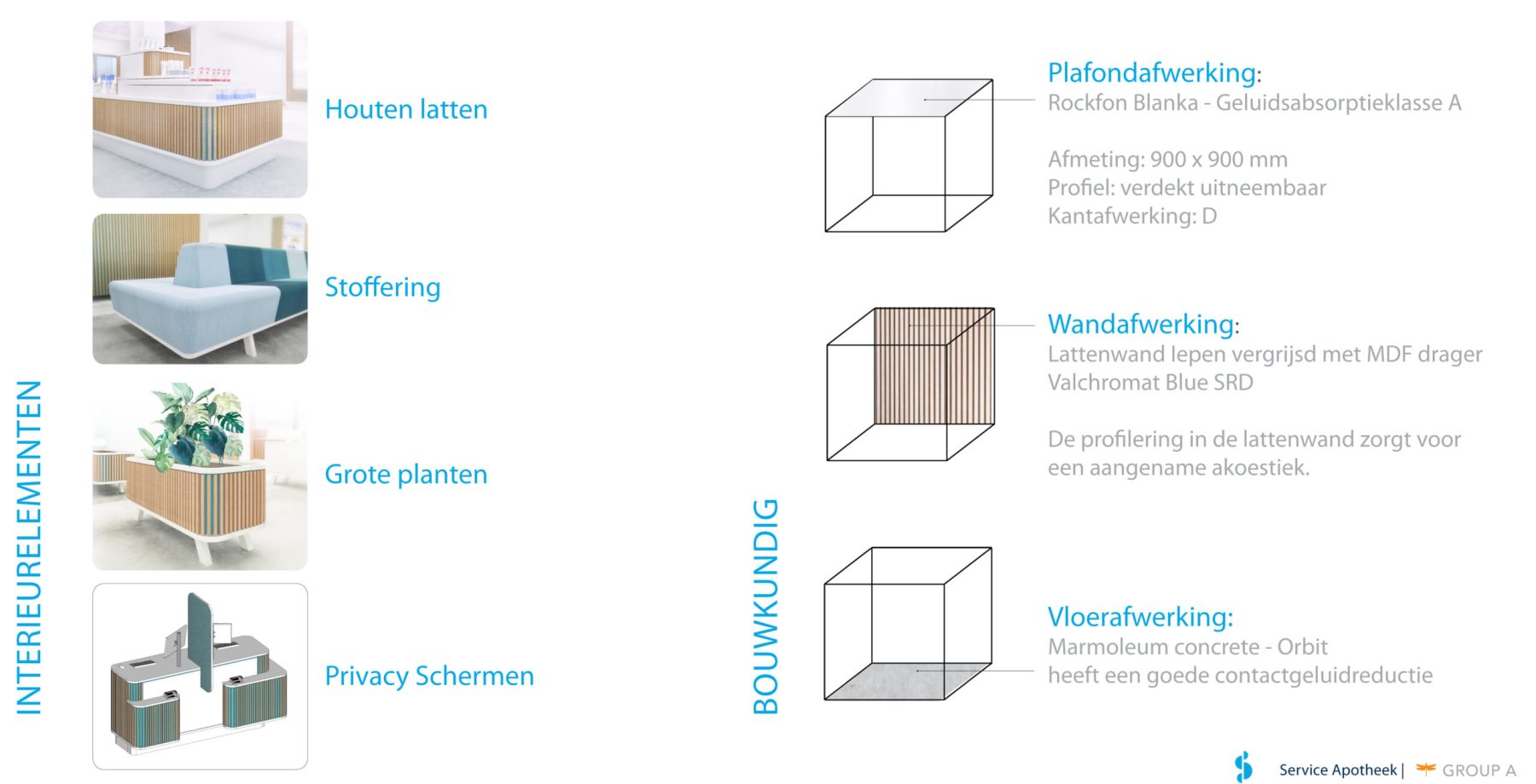
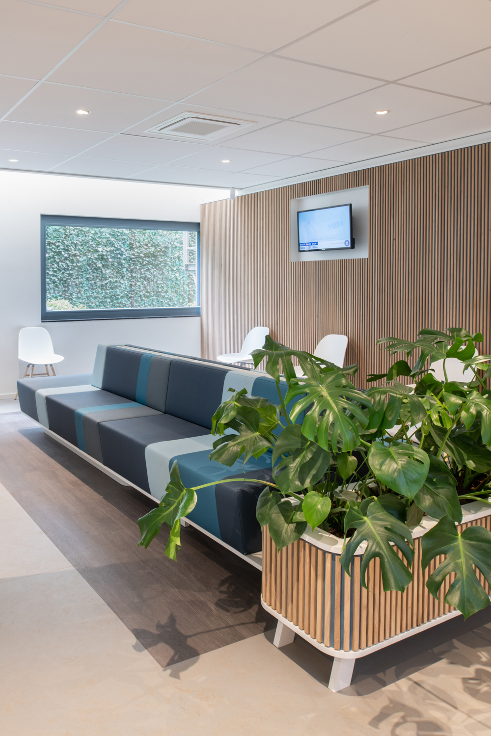
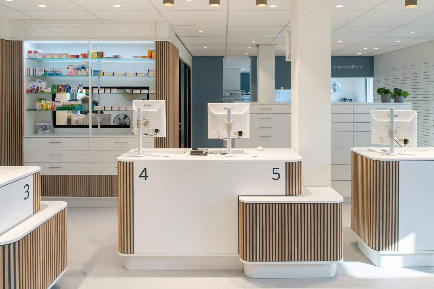
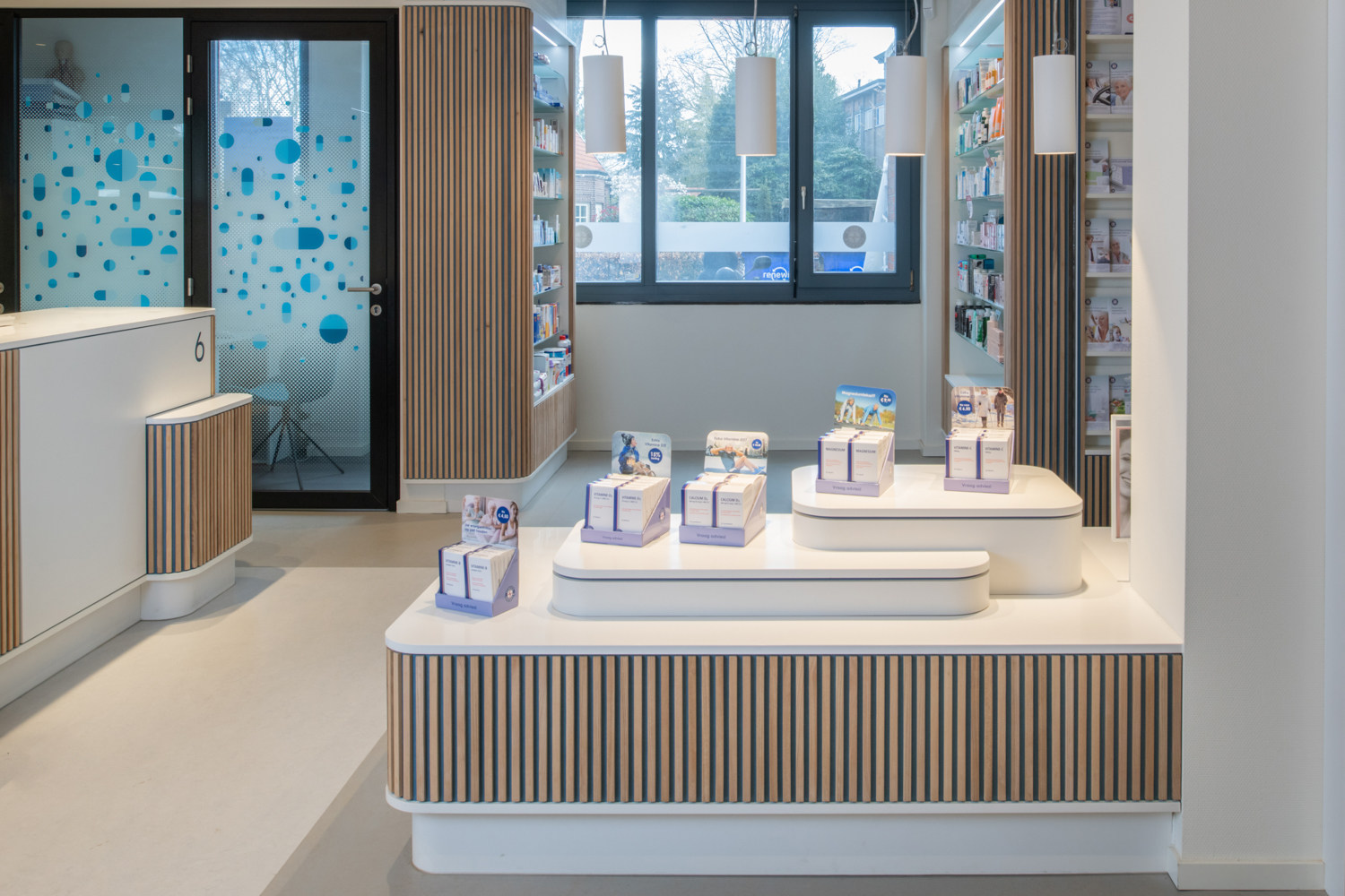
Service Apotheek consists of around 500 independent franchisees. The new interior could therefore not be implemented overnight. The diversity of different pharmacies and circumstances also has consequences for the feasibility. This is why a scalable and modular ‘brand interior concept’ was chosen, by developing a ‘Toolbox’, captured in an element matrix. The ‘Toolbox’ consists of various interior components, including counters, hand sales displays and showcases, planters, promotional furniture, modular benches and play furniture, which can be implemented independently. The element matrix is used as a choice palette where the ambition and size of the pharmacy can be quickly set against the possibilities and investments.
Shades of blue
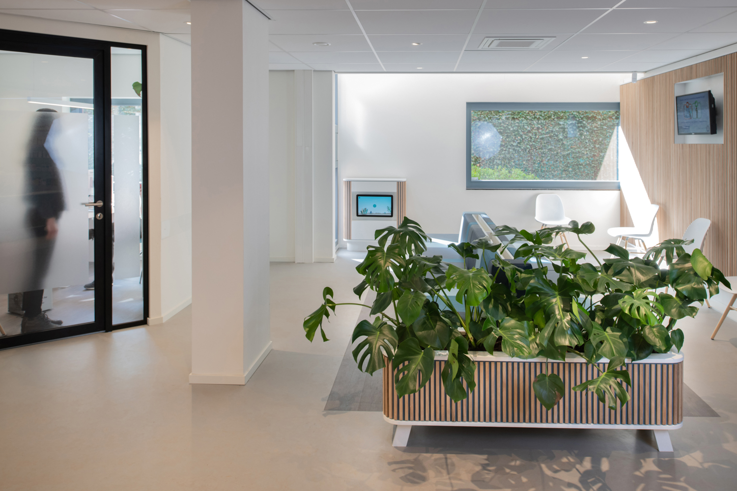
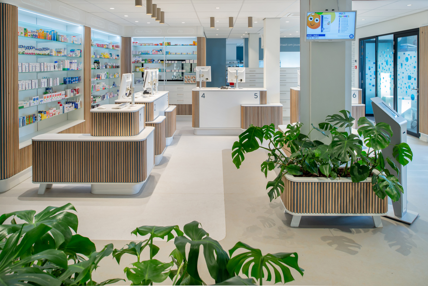
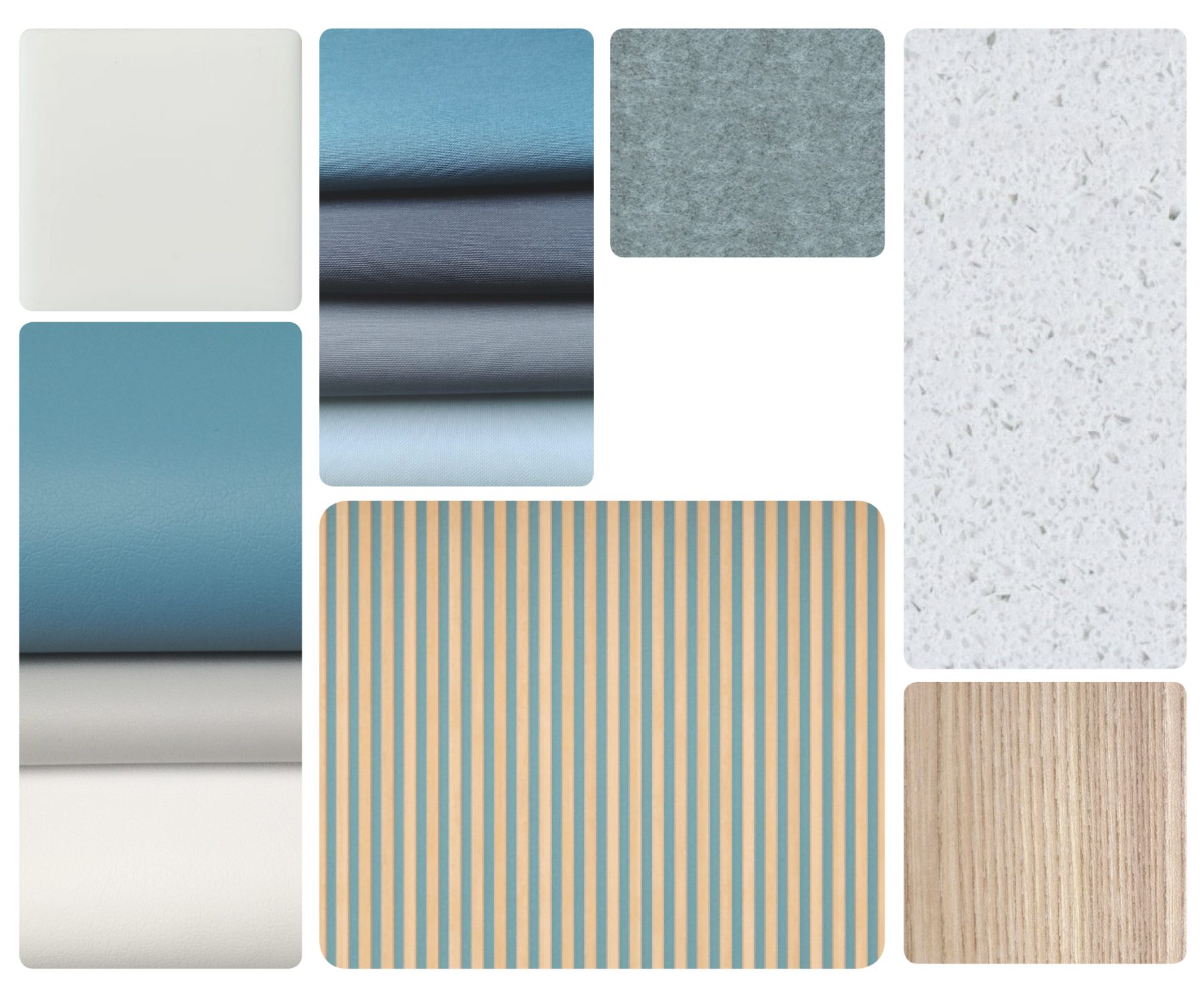
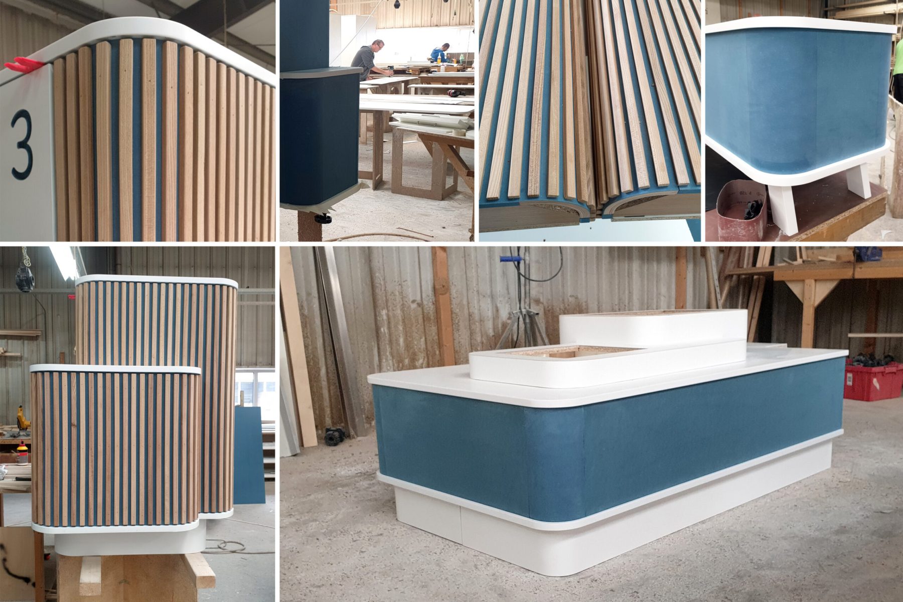
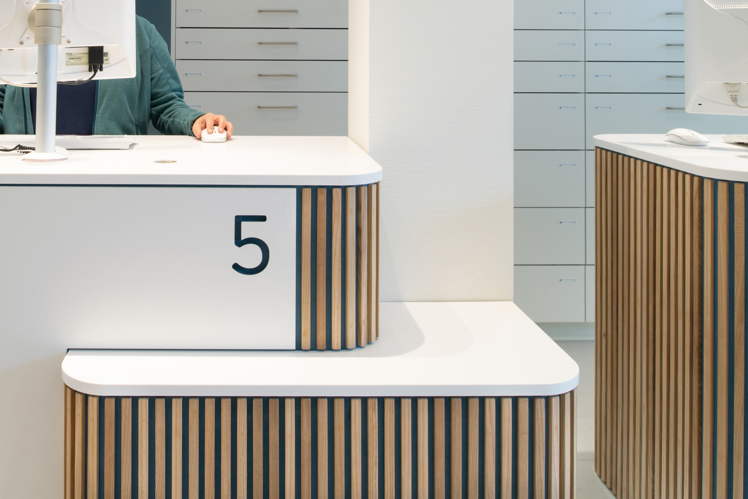
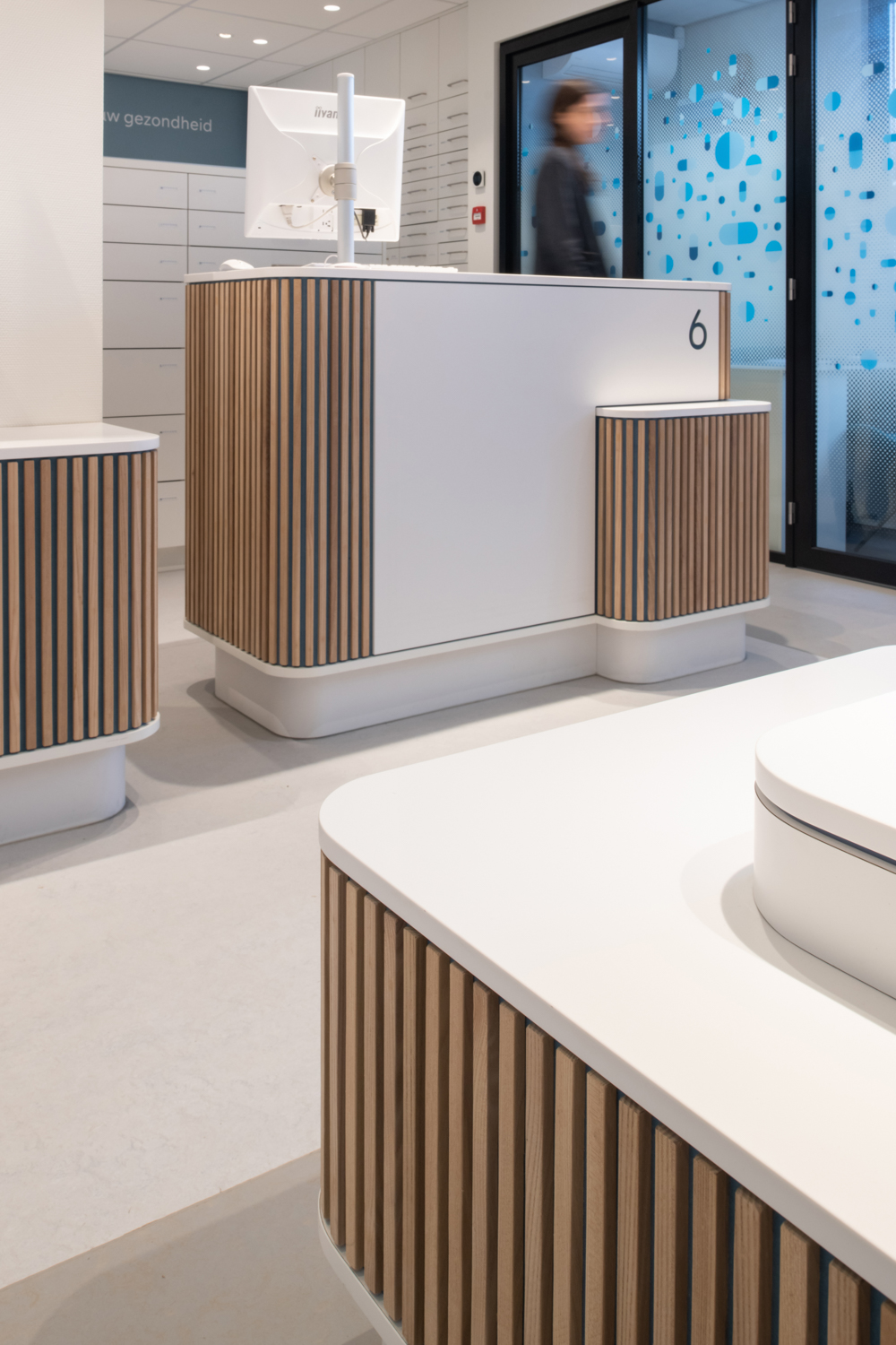
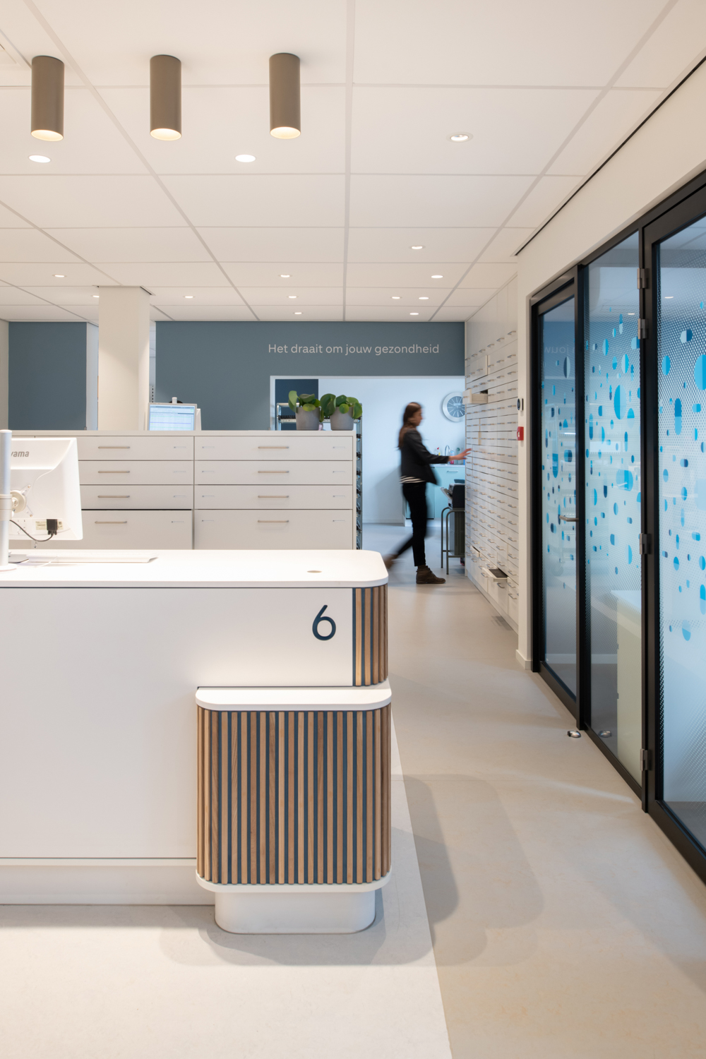
After implementing the various elements from the ‘Toolbox’, we see an open, warm, friendly and yet professional atmosphere for the waiting and public area. The vertical solid wood laths on blue MDF and the blue shades on the waiting bench stand out, set against a neutral white to warm grey background. In the look and feel of the counter & consultation area, the counters and service desks are defining and crucial for the feeling you get from a visit to the pharmacy. Clear and tidy, but not too clean. Open and transparent but with enough privacy. The back office is the domain of the pharmacist. In atmosphere it connects to the counter and consultation area, but is more technical and professional with fewer blue accents in the same neutral white environment. A sophisticated lighting plan and good acoustic measures make the overall result a new pleasant working and customer environment.
Circularity
The interior elements that do not conflict with the new interior concept will be retained or adapted. For example, a counter will be reframed, pharmacy cabinets will be covered with new film or a sofa will be re-upholstered. In terms of sustainability and budget, we use materials and raw materials as economically as possible. Re-use is preferred over new. A materials and interior elements databank will be set up from which the various pharmacies can choose.
All these interventions contribute to the positive perception of visitors and employees and to the individual recognition of pharmacies. And to the aims of strengthening the hospitable image of the Service Pharmacy brand.
Facts
Client
Service Apotheek
Assignment
Interior
Location
Various locations in the Netherlands
Function
New interior concept Service Apotheek
Start design
April 2020
Start construction
September 2020
Completed
November 2020, pilot Service Apotheek Epe
In collaboration with
Fabrique
Photography
Aiste Rakauskaite
